Sign Up Form - UI Challenge #1
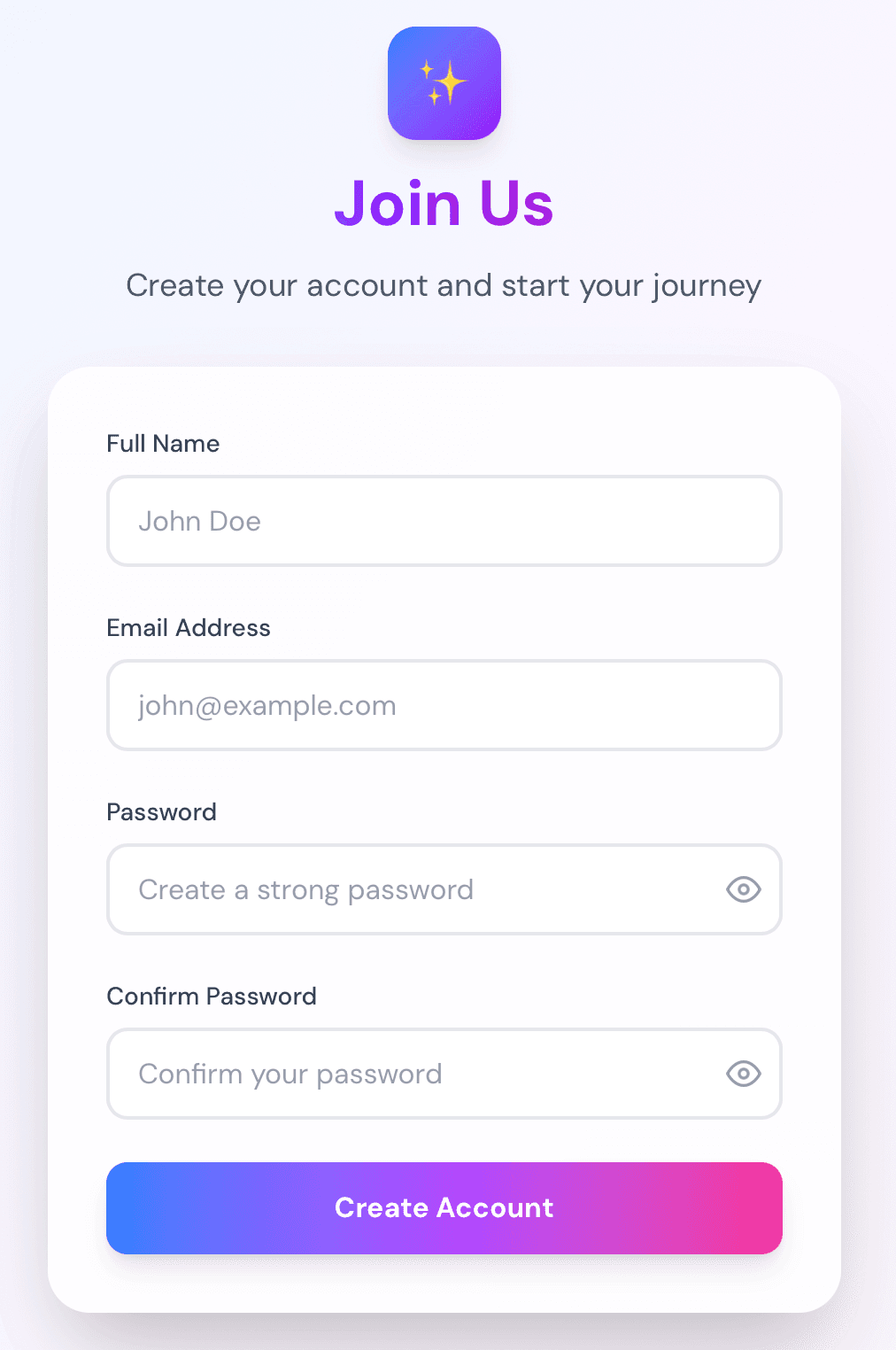
A creative exploration of sign-up form design, focusing on reducing friction and creating visual delight. This challenge explores gradient-based design, glassmorphism effects, and real-time validation patterns.
Try the live demo →
The question
What if I designed a sign-up form that feels delightful and reduces friction, rather than feeling like a chore?
Hypothesis
By focusing on progressive disclosure, clear visual feedback, and thoughtful micro-interactions, I can create a sign-up experience that users actually enjoy completing.
Process
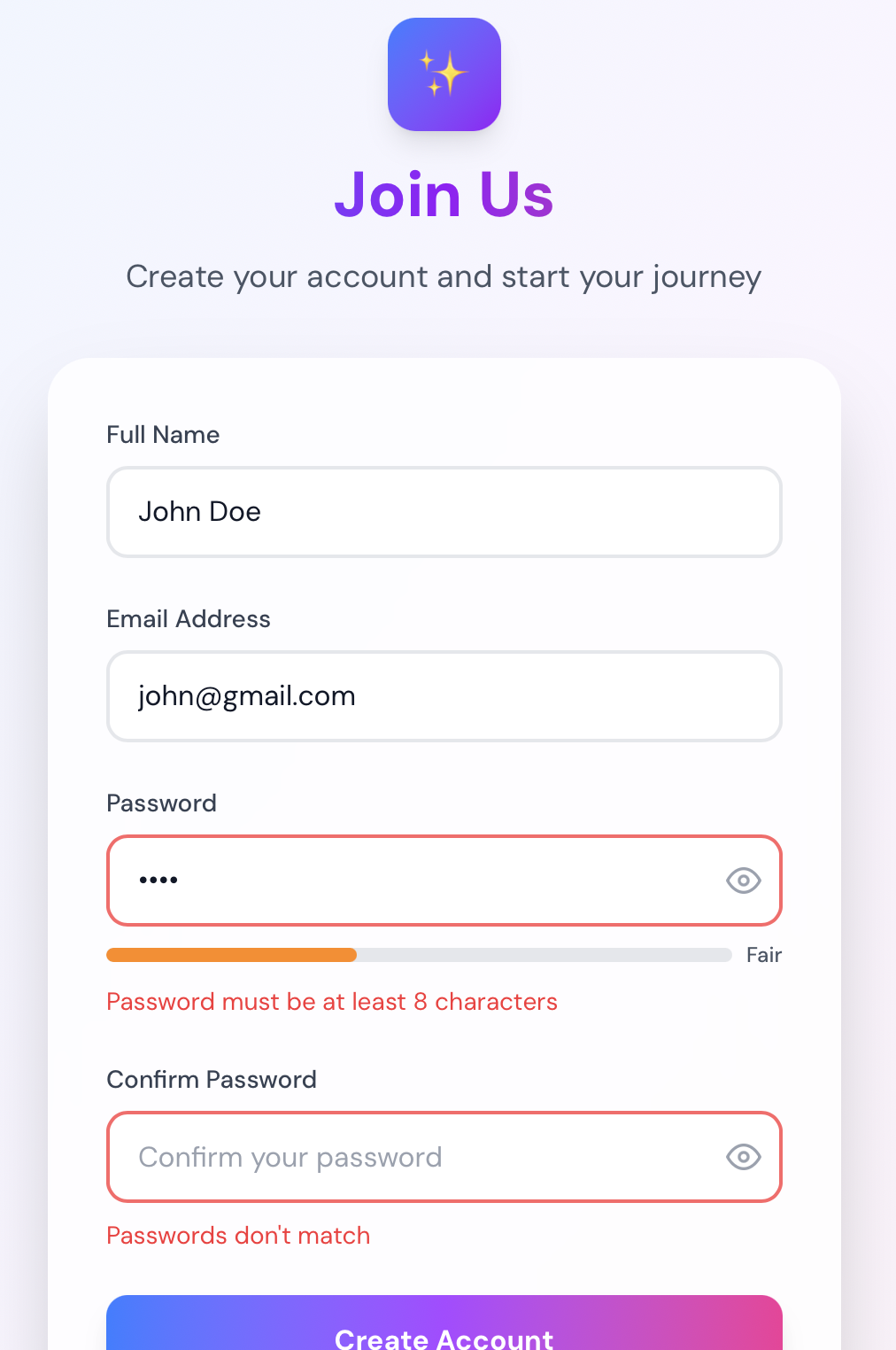
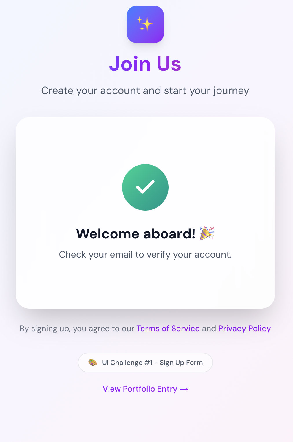
Started with exploring different visual directions - minimal vs. bold, single-step vs. multi-step. Chose a gradient-based design with glassmorphism effects for a modern, premium feel. Implemented real-time validation with helpful error messages positioned below each field. Added password strength indicator with visual feedback (5 levels: Weak to Very Strong). Tested various animation timings for the success state, settling on a smooth fade-in with scale effect. Used React Hook Form for form state management and Zod for schema validation.
What worked
Gradient backgrounds created visual interest without being distracting. Password strength meter provided clear, immediate feedback. Real-time validation reduced user frustration by catching errors early. Glassmorphism effect added modern, polished feel. Smooth animations made interactions feel premium and responsive. Color-coded password strength made requirements clear.
What didn't work
Initial color palette was too vibrant for some users - toned it down. Password requirements needed clearer communication upfront - added strength indicator. Success state animation was too quick initially - adjusted timing. Some users found the gradient button distracting - could explore solid alternatives.
Key learnings
- Visual feedback is crucial for form confidence
- Password strength indicators reduce abandonment
- Micro-interactions make forms feel more responsive
- Gradient buttons can be effective if used thoughtfully
- Glassmorphism works well for modern, premium feels
- Real-time validation improves UX when done right
Next steps
Try a completely different visual direction (minimal, bold, dark theme). Experiment with multi-step forms for longer sign-up flows. Test with real users for feedback on color choices and interactions. Explore different validation patterns (inline vs. on blur). Consider adding social login options.